
by Caroline Hayward
May 23rd, 2014
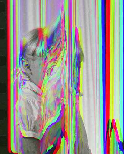 Flat Death is the latest iteration of an ongoing project by artist and photographer Sara Cwynar. Through a process that encompasses collage, photography, sculpture and digital alteration, she obsessively manipulates found photos and objects to create works that confront the image as an influential object in contemporary society. Through her process of intervention and rephotography, she questions how images affect our perception of history, the passing of time and prevailing culture.
Upon entering the gallery, the viewer is greeted by a neat line of images, an L-shaped stream of seemingly disparate commercial photographs, arranged like a film reel. I was lucky enough to be able to converse with the artist about her process and conceptual intent before the opening on Friday night, right after the show had been hung. She stated: “I wanted to scan the gamut of photographic tropes, but the mundane, lower-photo tropes, not something you would normally think of as an art photograph. I wanted to have studio photography, product shots, there’s the nature photo, portraiture and then these how-to photography manuals, so all of these different forms of democratic photo.” The imagery is indeed distinctly familiar: an image of a toucan from National Geographic, black and white photographs of vintage books, and enlarged advertisements for Dentyne Gum and Lifesaver Mints. These commonplace images have been scanned, rephotographed, reprinted, taped together and layered over the original to create a trompe l’oeil effect. The photographs of photographs disrupt the viewer’s sense of space and implore you to look closer. What seemed like a flat glossy magazine photo that you may causally glance over is actually a highly constructed image embedded with layers of meaning.
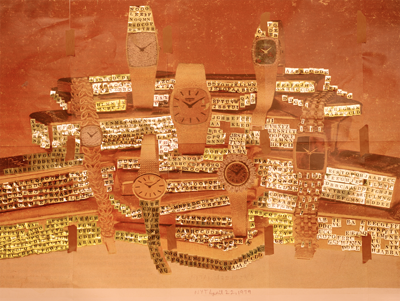 The types of images Cwynar selects for manipulation are often culled from the same genre of commercial photography she has contributed to in her work as a graphic designer. Cwynar is acutely aware of how her experience as a designer has influenced her art practice: “I still try to do some design projects, because I like the contrast between this open field where you can just do whatever you want and the very prescribed parameters of making a design project.” In her artwork, however, the intent is to bring attention to the fallacious nature of advertising images rather than to lure the viewer into a state of numb oblivion. In Gold –NYT April 22, 1979 (Alphabet Stickers), Cwynar has resurrected an image from The New York Times (where she formerly worked as a graphic designer) and reintroduced it as a symbol of how print advertising shapes our ideas of value. The faded page featuring elegant watches lavishly draped over bars of solid gold has been covered with hundreds of shiny gold alphabet stickers. It has the effect of rendering the underlying magazine photo lackluster and dull in contrast to the light-reflecting, three dimensional quality of the foil letters-which of course hold little actual value in comparison. The obvious construction of this image parodies the way that images in our everyday lives have been constructed to seduce us. What was once a beckoning message of luxury and glamour becomes one of gaudiness and obsolescent ideals.
 In her recreations of ancient ruins like Islamic Domes (Plastic Cups), Cwynar starts with a picture of an overly photographed relic of human culture. She then reinterprets the structure in her studio, creating a sculpture out of Tupperware and plastic cups, which she in turn photographs. Using her original photograph as a reference point, the photograph of the sculpture is artfully lit and printed in a way that disguises it as a dated image. Finally, she reprints and enlarges this photo again in several sections before taping it back together with colored duct tape in a final attempt to fuse this imagery with our contemporary worldview. In many ways, this has an interrupted nostalgic effect, our attention is brought to the fact that things were never as perfect or as terrible as we imagined or remembered or were led to believe. Our perception of the past is often colored with our experience in the present. Sometimes we need to tape the past back together in order to categorize and make sense of it.
Opposite this line of photographs are two “florals,” harvested from homemaking magazines from the sixties and enlarged to monumental proportions. These compositional bouquets are strategically overlaid with thousands of tiny knicknacks including pencils, pills, matchboxes, IPods, rolls of tape, rubber bands and remote controls before being rephotographed from above. A melted candle has a particularly nice petal-like quality. The kitschy objects have been arranged by color and shape to mimic the structure of the flowers in the photo underneath. When I asked Sara how she had chosen the objects for the photographs, she responded, “I really like the idea of this common archive that everybody has and how you can look through these pictures and recognize the items. These very highly produced art images are actually made out of these really familiar things that everyone can relate to in a way, and I am really nostalgic for a lot of this stuff. I’m kind of a nostalgic person who saves everything, and I think there’s kind of an existential impulse to that, like creating this outside physical version of yourself that represents you in some way.”
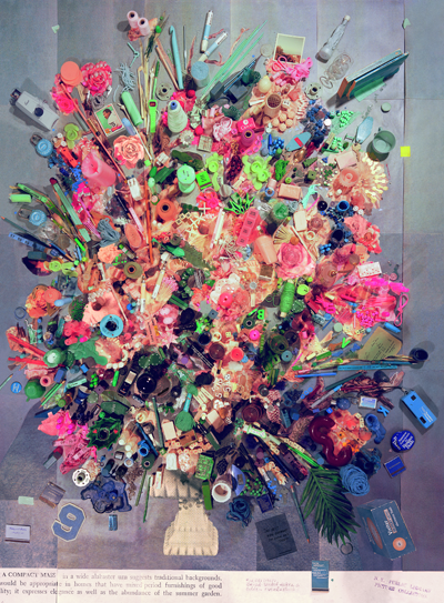 In Contemporary Floral Arrangement 5 (A Compact Mass), Cwynar has a slightly more critical take on the bits and pieces that make up our contemporary “common archive.” The dated color scheme of the original photo in peachy pinks and powder blues questions how gender stereotypes have evolved (or haven’t) since the photo was originally produced. In the collage layer, the pinks are made out of lots of distinctly feminine objects like artificial nails and hair rollers. The blue objects tend to be more boyish and even sports-oriented. Although the items and their tidy, gender-specific themes seem completely at home within this seventies color scheme, they are actually sourced from the drugstores and convenience stores of today. This suggests that our culture, as much as we would perhaps like to deny it, has not completely overcome these stifling sexist stereotypes. “I wanted it to be able to maybe take on this other meaning,” the artist said of the piece. “I was really interested in making that challenge for myself. I wanted to begin with a lot of pink and see what would happen in terms of women’s products and all of these pink feminine things and see how much that idea is still happening. It’s 2014, and it still happens so much if you start looking for it.”
By drawing on the communal visual archive of the recent photographic past, Cwynar has proposed an intriguing thesis about the way our visual culture impacts us on a deeply psychological level. Her process of mixing and combining the past with the present, the digital with the analog, and kitsch with fine art photography proves that nostalgia is not exactly just a feeling. It is a cultural process generated by the building of layers upon layers of memories, images, and objects that we variously experience, encounter, reject, own, and yearn for.
Flat Death, Sara Cwynar’s first solo show in New York, will be up at Foxy Production Gallery in Chelsea from April 4th-May 3rd 2014.
Eight Perfect Murders by Peter Swanson
The Death of Sitting Bear by N. Scott Momaday
East Villager Billy The Artist Climbs Atop Ai Wei Wei's Fence To Shine A Light On It
A Quick Note on Transplants: Greek Diaspora Artists
Teddy Thompson’s Ultimate Funeral Mix Tape
Moray Hillary, Pre-New Reflective by Heather Zises
SELFISH, Review by Heather Zises
Winter Realm Series by Noah Becker
Paul Rousso at Lanoue Fine Art
Airan Kang, The Luminous Poem at Bryce Wolkowitz Gallery
Damien Hoar De Galvan at Carroll and Sons
Antigone, 2015, directed by Ivo van Hove
Karen Jerzyk's unsettling Parallel World
CEK - Concrete Functional Sculptures
Alexis Dahan, ALARM! At Two Rams
Do Ho Suh, Drawings, at Lehmann Maupin
Nir Hod, Once Everything Was Much Better Even the Future
Exhibition Review: Mario Schifano 1960 – 67
Subverting the Realist Impulse in the Work of Shauna Born
Linder: Femme/Objet by Erik Martiny
What We Do in the Shadows by Jemaine Clement and Taika Waititi
Justin Kimball at Carroll and Sons
Told & Foretold: The Cup in the Art of Samuel Bak, at Pucker Gallery
Accumulation: Sculptural work by Alben at Gallery Nines
Art Paris Art Fair 2013 Review
Paris Street Art Musée de la Poste
Trellises by Katherine Tzu-Lan Mann
Topography of Destruction Kemper Museum
L'art en Guerre : France 1938-1947
The Louvre Relocates to Africa
A French Priest, Tears and Fire the Art of Jean-Michel Othoniel